
ux rESEARCH: The atomic way
Role: Product Designer
Stakeholders: Product Team
Tools used: Hotar, TrymyUi, Gleanly, Sketch
Atomic. Not just a classic by ‘Blondie’, but a set of principles that have helped shape my approach as a designer, and subsequently how ‘Seenit’ approaches software development.
In this case study, I divulge how I have helped implement atomic research principles at ‘Seenit’, enabling the team to understand user problems and solve them fast.
To help with context, ‘Seenit’ is a content collection and curation platform, enabling anyone anywhere to upload media to “Stories”, which are then put together into single ‘edits’ by users. A studio user could create a story in their workplace about a particular topic i.e. “what’s life like working at [company]”, and request their colleagues to upload media to it.
Atomic research you say? 🤔
Essentially, atomic research can be understood by the following :
Facts; the small nuggets of data collected from a variety of sources i.e. surveys, interviews, annotations of recordings.
Insights; what we think the facts mean. E.g. if 4 people said in a survey they don’t like your home page, then an insight could be that “most users don’t like our homepage”.
Recommendations; what are you going to test to action the insight? Build a new home page? Change the imagery used? Obviously this is a very broad example, but you could have multiple recommendations each moving the needle towards a homepage that users love.
With this framework, you essentially want to find as much data to prove or disprove your insights and recommendations. As mentioned before, if 4 people say specifically “I don’t like the homepage”, then those facts prove the insight. Equally, if you have feedback suggesting otherwise, you would then disprove the insight. In short, 4 proving facts and 1 disproving fact would still have a proving factor of 3.
The same principle can be applied to your recommendations. Several insights may help prove a recommendation is best, or potentially disprove. Still following? Good stuff.
How does it work in practice? 🔧
At Seenit, user recordings, remote user tests, surveys and more, are frequently monitored and conducted to try to understand how our users feel about the platform.
One key issue I discovered, was that users found friction in having to sign up to complete their transaction of uploading media to our platform. Here below are a few examples of some of the facts I gathered:
“Participant 1 didn’t understand why signing up was required”
“Participant 5 wasn’t sure whether sign-up was required”
“Still a frustration that you had to sign up. Could we not capture just their name?”
“Sign up is a roadblock to content collection”
The general themes I found during this process can be explained as insights, listed below:
Users don’t understand why an account is required
User’s don’t want to sign up
In the platform, the sign-up process is rather complicated from a development perspective, so naturally we’d want to make small changes. Looking at both insights, sure, an easy recommendation would be to remove the sign-up process entirely and allow for the free uploading of media (or even just a name/email capture.) But that would take a lot of work.
What I opted for was a copy change on the login modal, explaining in more detail why an account was required. Below is the original, and the change.
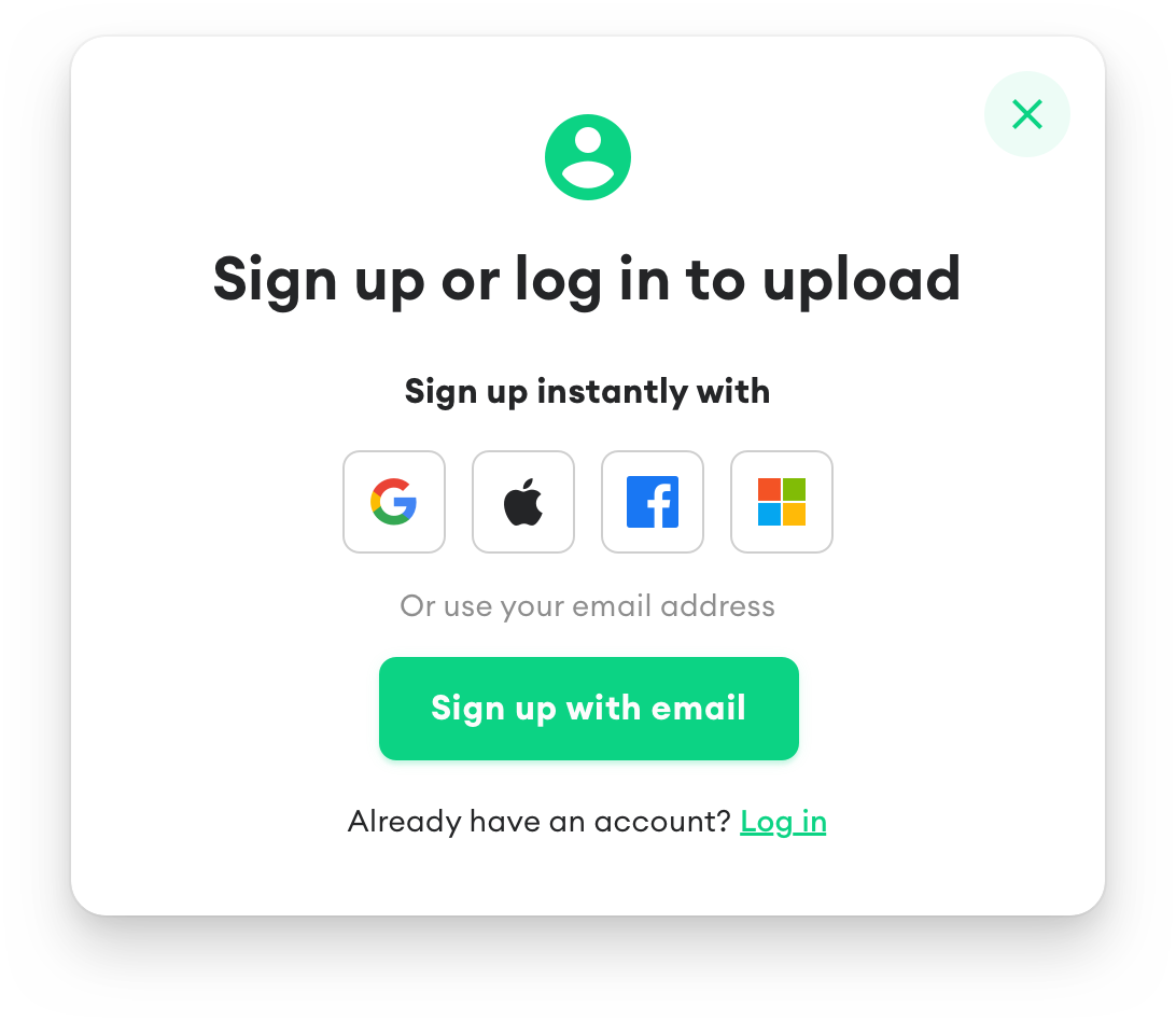
Original login modal
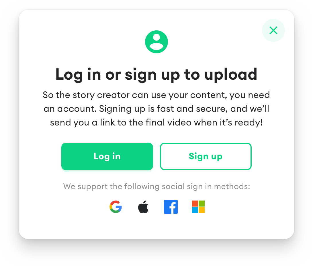
Revised version
Did it work? 🔍
From the point of introducing the copy change, I added an additional survey question on our monthly remote user tests, specifically asking:
Is it clear why you had to sign-up to complete your upload? Would this block you in a real-world scenario?
Let’s take a look at some of the facts received after the change…
“Yes it was clear as to why I had to sign up so that I can upload mainly due to privacy reasons and so that it can be uploaded to my story, and personally no this would block me in a real world this would tell me that it’s privacy reasons and so that it’s handled the correct way.”
“Yes it was clear, you must have an account so they have a record of you accepting their terms and privacy policy.”
“Yea it is very clear to me because it was personal information”
“It isn’t exactly clear why I had to sign up because I feel that I could have just started my name and info”
Overall, it would appear that it was clearer to users why an account was needed. Equally, observing our data, we saw a slight uptake in the number of users completing their uploads, inferring that we had instilled a bit more confidence in our users.
However, as you can see from the last fact, we had another mention from a user regarding leaving their name/email rather than signing up… a common feature in e-commerce known as ‘continue as guest’.
fINAL THOUGHTS ⚛️
By following atomic research principles, you can identify key problem areas in your product, and provide multiple recommendations to help tackle the problem, from the simplest idea to one that is complex.
As discussed in this case study, I made some progress towards increasing the number of successful uploads, by iterating on the design of the sign-up modal. However, through additional research, the insight of providing “guest access” was further proven.
gOT feEDBACK?
Please drop me a message with any questions or comments. Cheers!