
Crosstab
USABILITY STUDY
Role: Sole Designer for 1+ years on tool. All aspects of design, research, analysis for this study.
Stakeholders: Product Team
Tools used: Sketch, Marvel, Maze App, Mixpanel
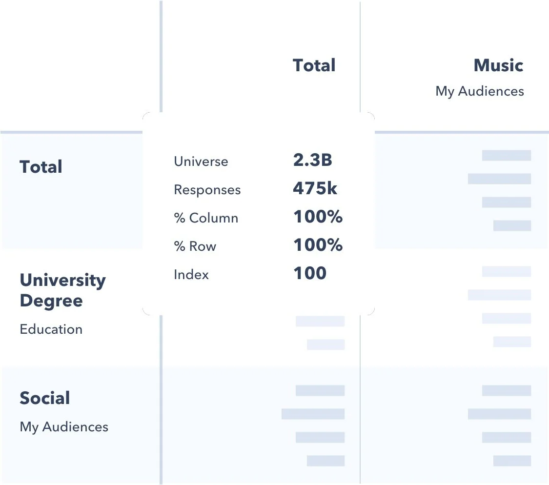
Crosstab Builder is a feature within the GlobalWebIndex Platform, specifically designed for research professionals. In general, this tool allows users to compare two different variables in a 2-dimensional table, using data provided by GlobalWebIndex research.
For example, one dimension (a column) can hold a group of people (let’s say 16-30 year olds), and then the other dimension (rows) can hold different facts or statements to compare against (like one row showing “I have 1 car” and another row showing “I have 2 cars”). To put it simply, a user can now see how many cars 16-30 year olds own.
This tool is already widely respected for it’s intuitive UX and well-designed UI, however there is room for improvement, and plenty of opportunities to test ideas.
“Your Crosstab builder is the easiest and most user-friendly crosstab tool we’ve ever used”
what’s the Problem? 🤔
Whilst this tool provides users with intuitive ways of creating their tables and performing complex research tasks, trying to fit this all in to the screen real estate presents a challenge.
How do we enable users to identify all the features of the tool, without cluttering the UI?
One function the users can do in Crosstab Builder is Append data. Meaning, they can combine additional pieces of data on to items already in the table (remember our 16-30 year olds earlier? Imagine the user now extending that to 35 year olds).
This function is extremely powerful for users, but it is not obvious how to perform it. Based on word-of-mouth discussions, and low performance metrics (analytics were set up but given the infancy of the tool, benchmarks were still being determined), it seemed clear that users were not aware that the function was even available.
Not only this, but there are 2 happy paths a user could take to perform the append function, thus making it harder to track or analyse.
Hover on checkbox on table item > click checkbox > click new data in navigation menu > perform append function
Click new data in navigation menu > hover on checkbox on table item > click checkbox > perform append function
what’s the aim? 🎯
With the problem identified, I thought I’d be kind to myself and set not 1, but 2 aims for this experiment.
To determine the most frequent path the append feature is used
To understand how (where possible) data-driven design can improve the frequency of usage of append
tALK PROCESS TO ME 🔁
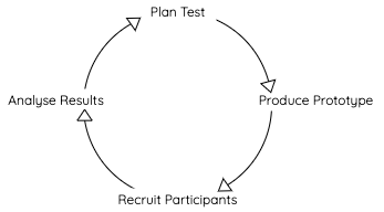
“Expert-level” process model of process followed.
10/10 for effort.
To begin, I set up the test instructions, and decide on design changes where appropriate
Secondly, I created a clickable prototype on Marvel, and linked with the Maze app to perform heat-mapping, click tracking, and other analytic options
Based on the test plan, test with expert or non-experts
Within the Maze app, see what path users are taking by analysing heatmaps,
As I was testing multiple aims, I knew that I had to perform the test again under different conditions, reacting to the results gathered.
lET’S TEST! 💪
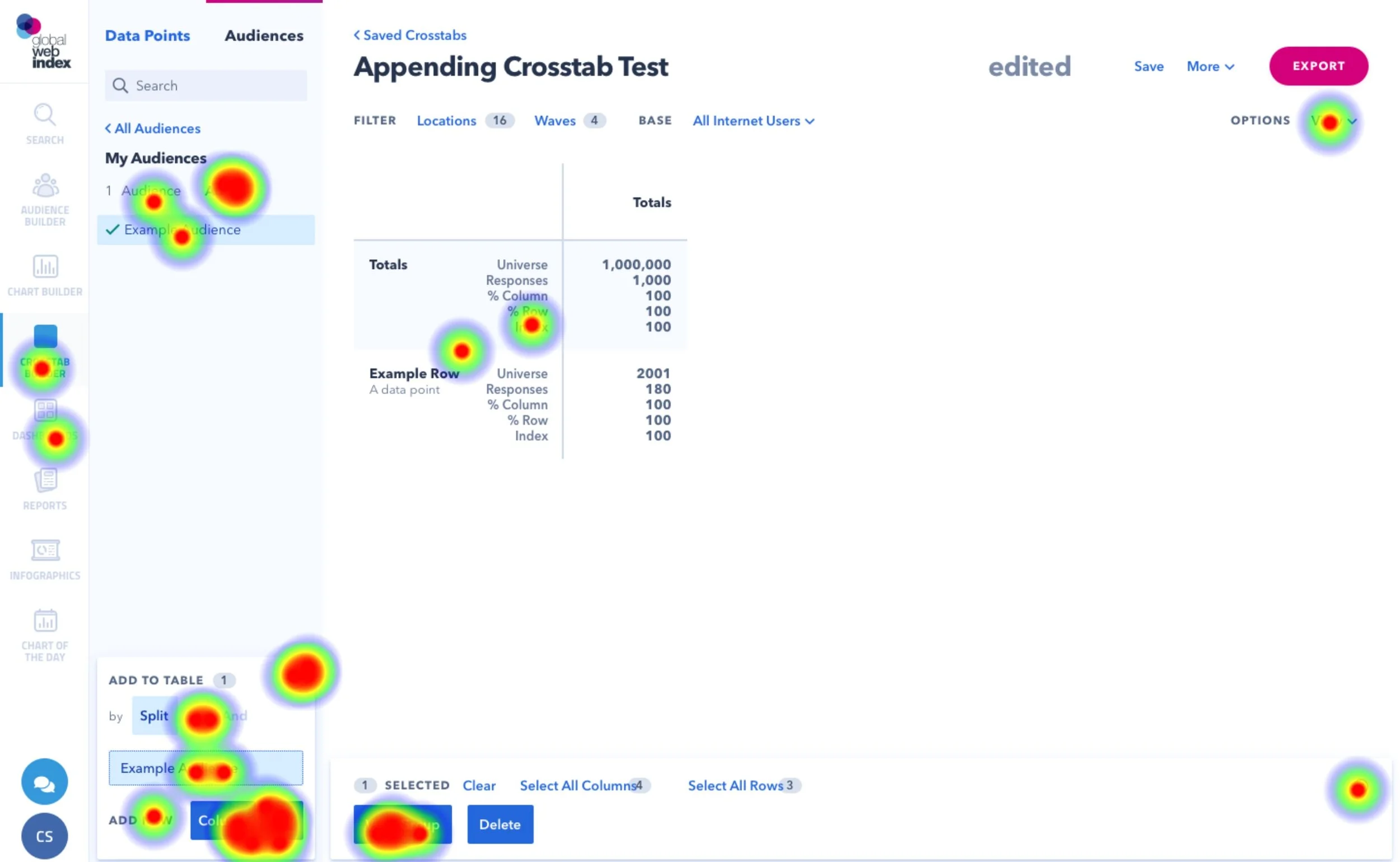
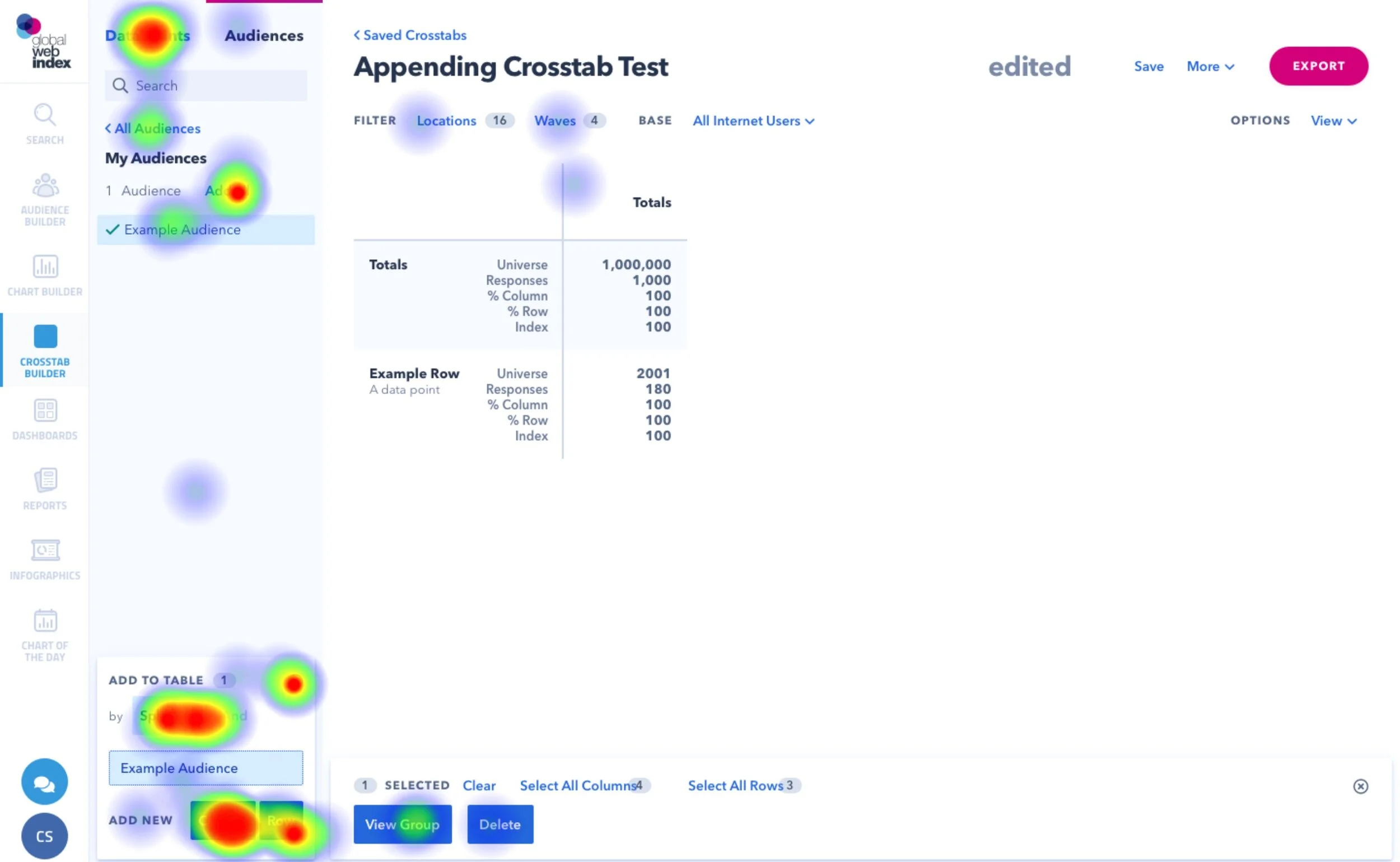
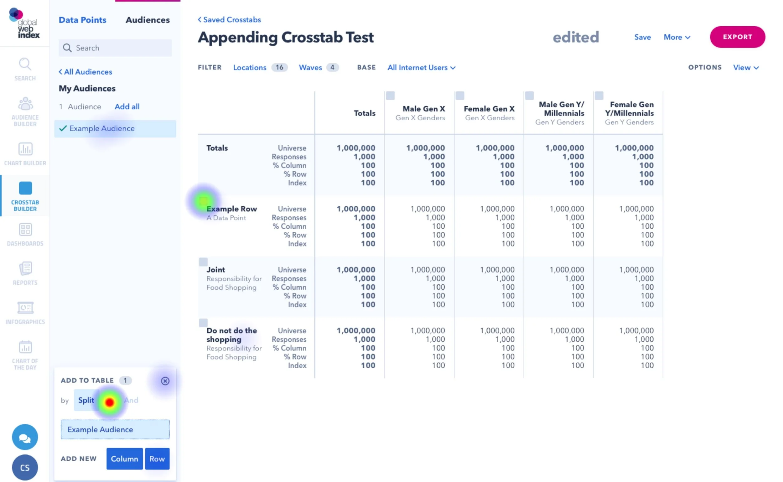
By testing, I identified that users predominantly select data items from the menu before selecting the table items they want to append to, thus making this the more obvious “happy path”. However, users could not complete this task! One particular step is when the user hovers on any item in the table, a checkbox appears suggesting it is selectable. In this test, users could not find that checkbox, and therefore either gave up the test, or asked for my help to complete it.
By studying user clicks and testing multiple prototypes, I came up with the idea to make the checkboxes on the table items persistent (shown in the 3rd image), and immediately users could complete the task!
The usability score went from 17 > 75 after making that change. Big gains.
the aftermath 💨
I presented my findings to the Product managers and tool stakeholders, and they immediately introduced my feature request of persistent checkboxes in to development.
Once the feature went live to the public, I then monitored the performance to see what improvements (if any) I could see to the append feature. For this, I measure the number of times the “append” event is triggered, before and after release.
Before (Oct 1st - Oct 31st 2019)
Total events = 936 🤷🤷🤷
After (Nov 1st - Nov 30th)
Total events = 1146 (+22%) 🎉🎉🎉
During the post-release period, there was also a general increase in the number of times the feature was used across multiple days. In the previous month, there were days with large spikes of the event firing (which could have been internal users).
Conclusion 👨🎓
By combining intuitive prototyping tools and analytics, I was able to achieve both of my project aims. Despite my experience being the sole designer for the Crosstab tool, I was surprised by the impact such a small change could make.
Furthermore, the test was well received by the stakeholders and wider product team, as it cemented further the importance of taking time to test features with users, rather than rushing to release a feature.
🏁 You made it! Thanks for reading!
gOT feEDBACK?
Please drop me a message with any questions or comments. Cheers!